Wraith House: Author brand with a gothic edge
Logo design, branding, social media, and newsletter design
Wraith House Publishing releases ethereal horror for readers of gothic romance and supernatural suspense. The brand had to feel like the books: a little haunted, and a lot beautiful.
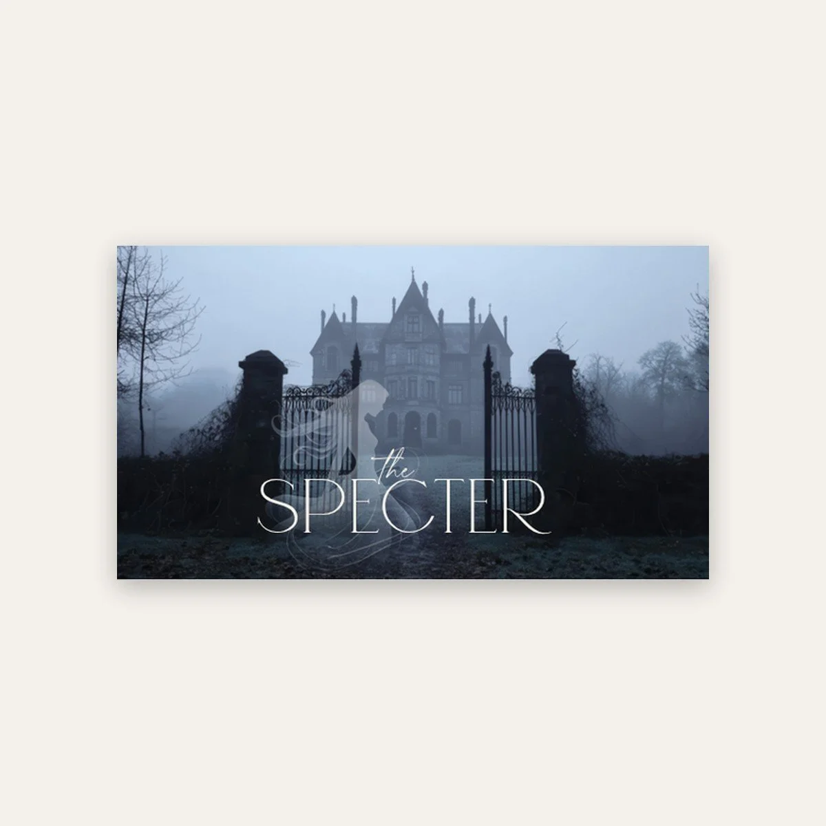
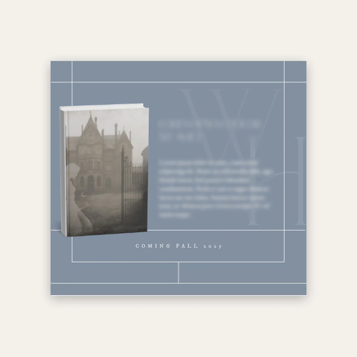
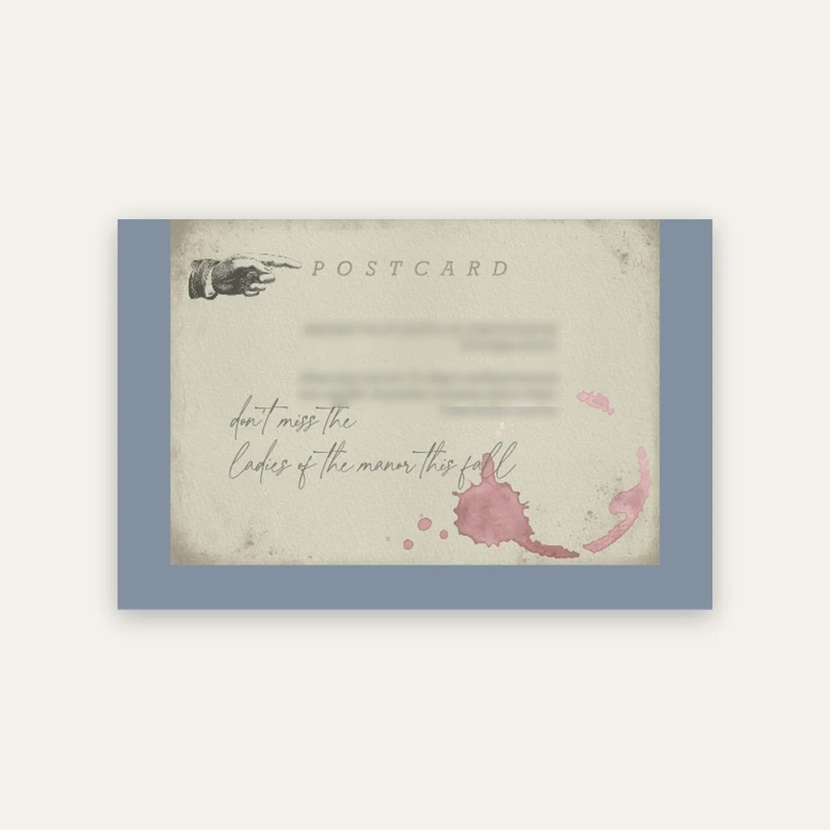
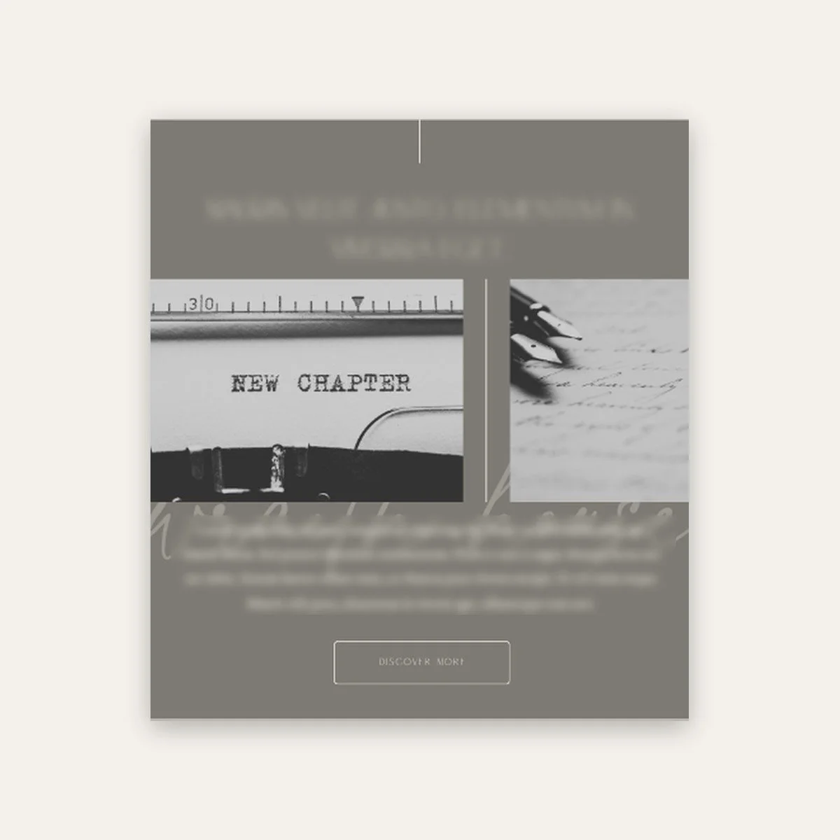
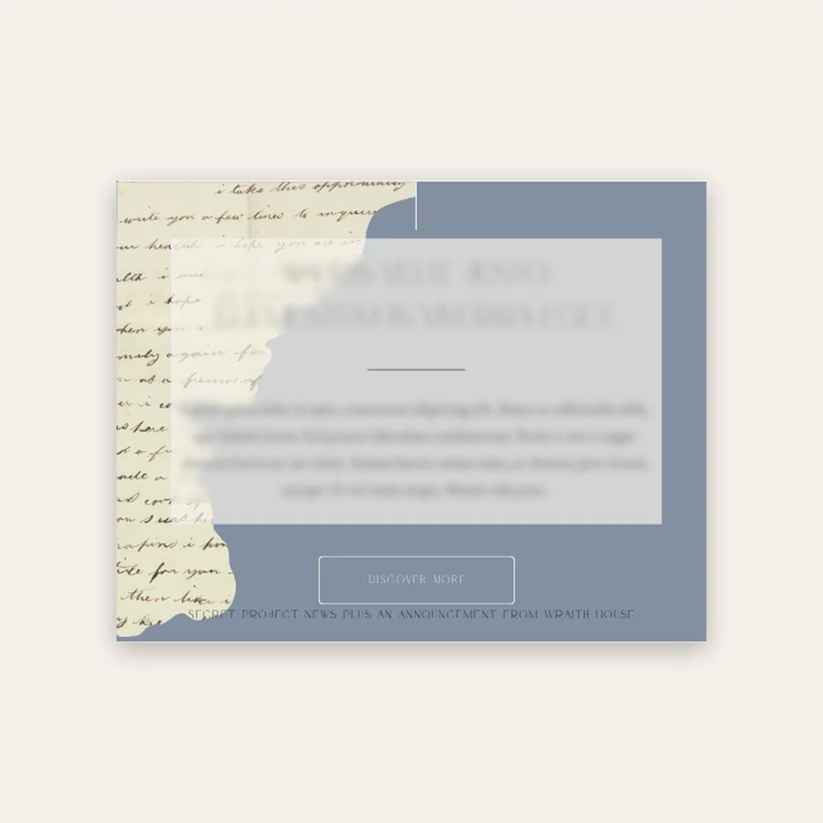
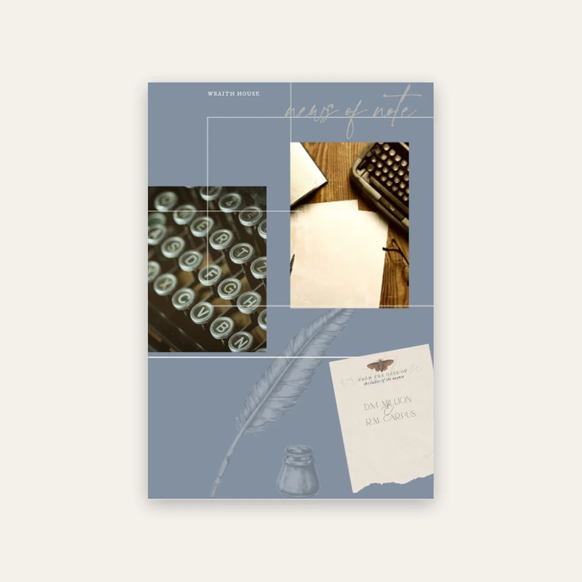
We built the identity, a social kit and strategy, and The Specter, their reader newsletter. The Specter works as a system. The cover banner and footer stay put, so every issue is unmistakably Wraith House. Everything in between mixes and matches: new-release features, vintage postcards, author notes and announcements, with a library of brand graphics to dress them. It’s set up in both Jot and Mailchimp, so no issue starts from scratch, and none of them look like it.
Wraith House is an author brand with a dark, gothic personality. I designed the full brand system and a library of illustrated elements to go with it.
The challenge
A gothic brand can tip into costume quickly. Wraith House needed a look that felt rich and a little eerie, with enough pieces to dress up books, newsletters and social posts for years.
What I did
Logo suite: square logo, banner logo, name banner, monogram and cameo mark
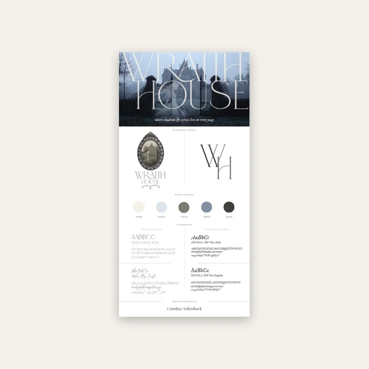
Brand style guide
A library of more than 30 illustrated elements, from keys and quills to clocks and potions
Newsletter design and book mockups
The result
Wraith House has a complete visual world to build in, so every release, newsletter and post looks like it came from the same haunted house.
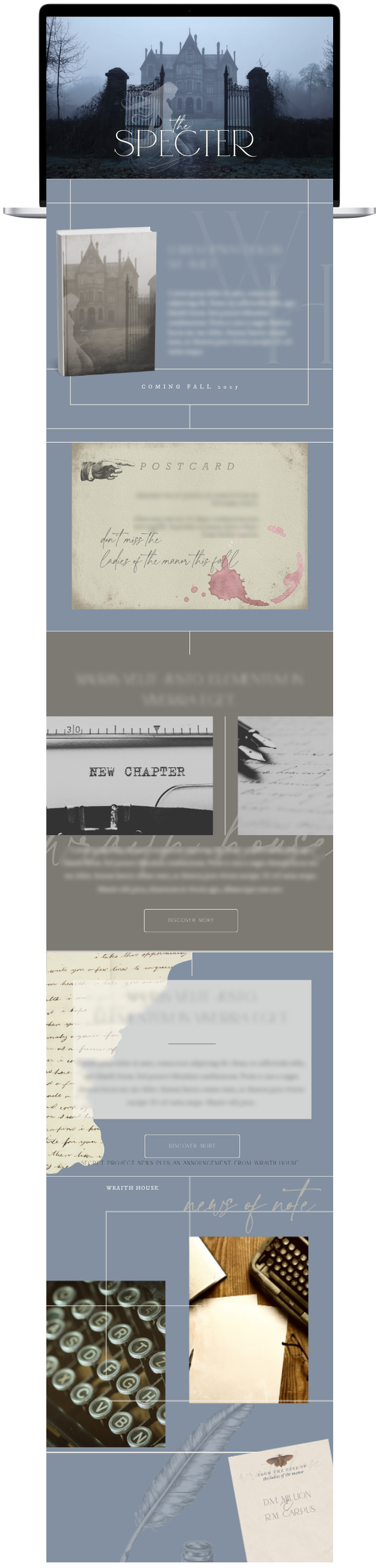
The Specter, brand and print